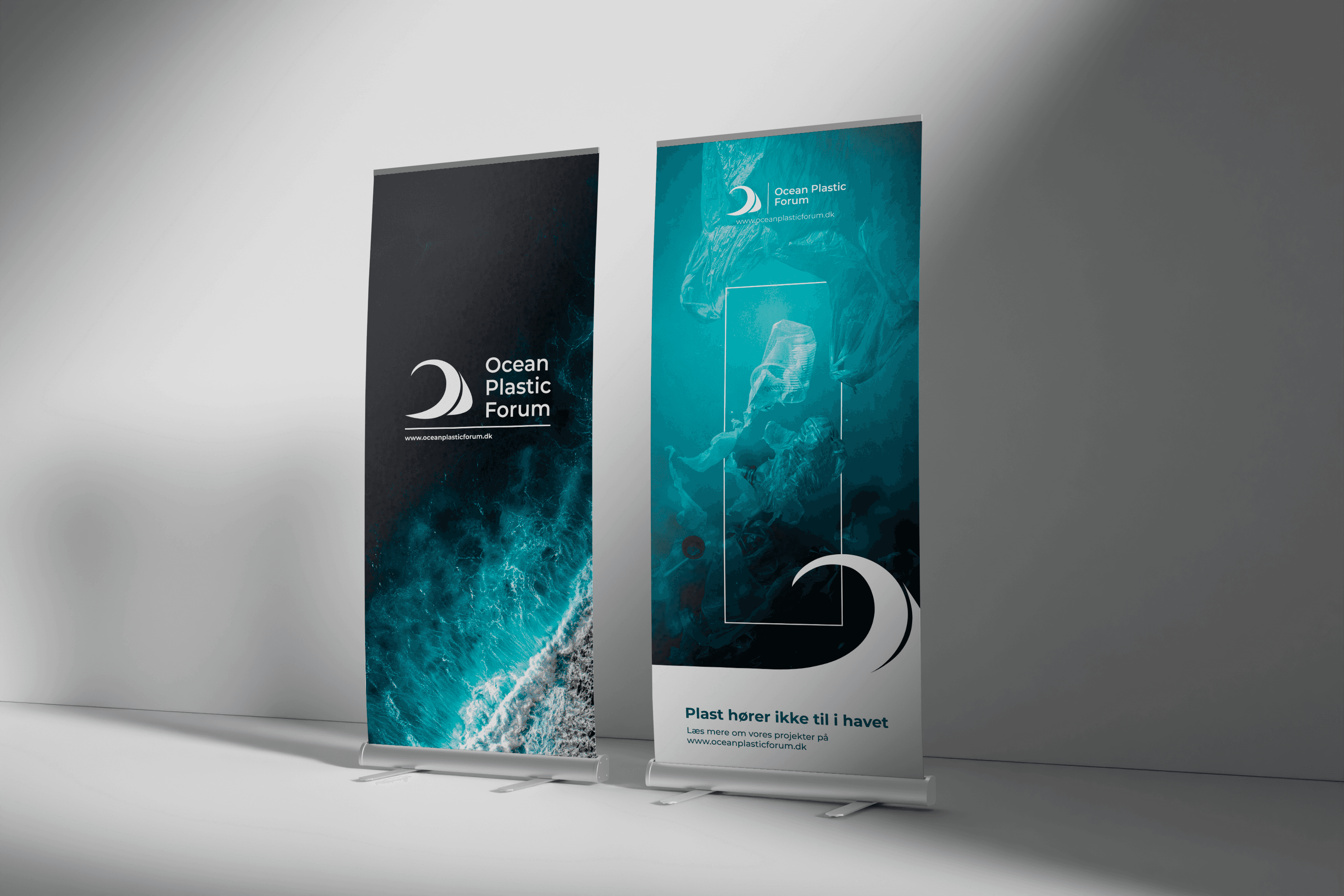
Ocean Plastic Forum - Visual Identity
Developing a cohesive visual identity for Ocean Plastic Forum through a refined logo system, exhibition materials, and brand assets designed for consistency across digital and physical touchpoints.

About the project
When I joined Ocean Plastic Forum, I was given the opportunity to refine and strengthen the organisation's visual identity. While the existing branding reflected the organisation's mission, it lacked consistency across different platforms and applications.
Rather than creating a completely new identity, my goal was to establish a clean, flexible, and recognisable design system that could be applied consistently across digital platforms, printed materials, public events, and international collaborations.
The project included redesigning the logo, developing brand guidelines, and designing communication materials such as roll-ups, flyers, and business cards that support the organisation's professional presence across a wide range of contexts.
Building a Flexible Identity System
The project began with redesigning Ocean Plastic Forum's logo. Instead of creating a single version, I developed a flexible family of logo variations that could be applied across different platforms while maintaining a consistent identity.
To support both the organisation and its international partners, I created a set of brand guidelines defining logo variations, colour palettes, typography, spacing, and usage principles. The aim was to provide a simple, practical system that made it easy to communicate the brand consistently across every touchpoint.
Every design decision was guided by the same principles: clarity, simplicity, and flexibility.


Applying the Brand Across Touchpoints
Once the visual identity had been established, it was translated into a range of communication materials that strengthened Ocean Plastic Forum's presence across both physical and digital environments.
I designed roll-ups for conferences, exhibitions, partner meetings, and public events, creating a consistent visual backdrop for presentations and networking opportunities. Flyers were developed to communicate projects and initiatives at conferences, exhibitions, workshops, and outreach events, making complex environmental topics accessible through clear, engaging layouts. I also designed business cards used during international collaborations, including project visits in India, where they supported networking with new partners and stakeholders.
By applying the same design principles across every asset, the organisation gained a cohesive visual identity that is both professional and easy to maintain.
Reflection
This project gave me valuable experience working with an existing brand rather than creating one from scratch. It taught me the importance of building design systems that extend beyond individual assets and instead create consistency across every interaction.
From logo design and brand guidelines to exhibition materials, printed communication, and business cards, the focus remained the same: creating a visual identity that is clean, scalable, and practical for both the organisation and its global network of partners.